AI image how-to · modifier
How to make personal color analysis with AI
Upload a portrait and use this AI prompt to create a visual personal color analysis. It estimates your seasonal color type and undertone, then presents a palette of flattering colors, versatile neutrals and clothing color comparisons so you can see how different shades look on you. Use the result as a personal guide when choosing clothes, planning outfits or deciding which colors to try next. It offers some of the inspiration you might look for from a stylist, in a format you can explore at home. Because lighting and camera settings can change how colors appear, treat the analysis as a starting point and test its suggestions in natural light.
Before
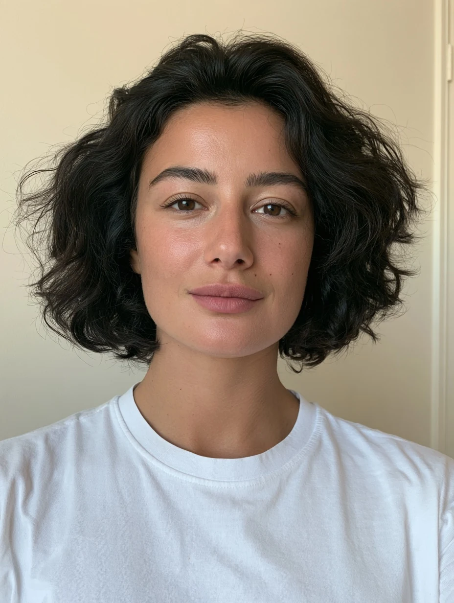
After
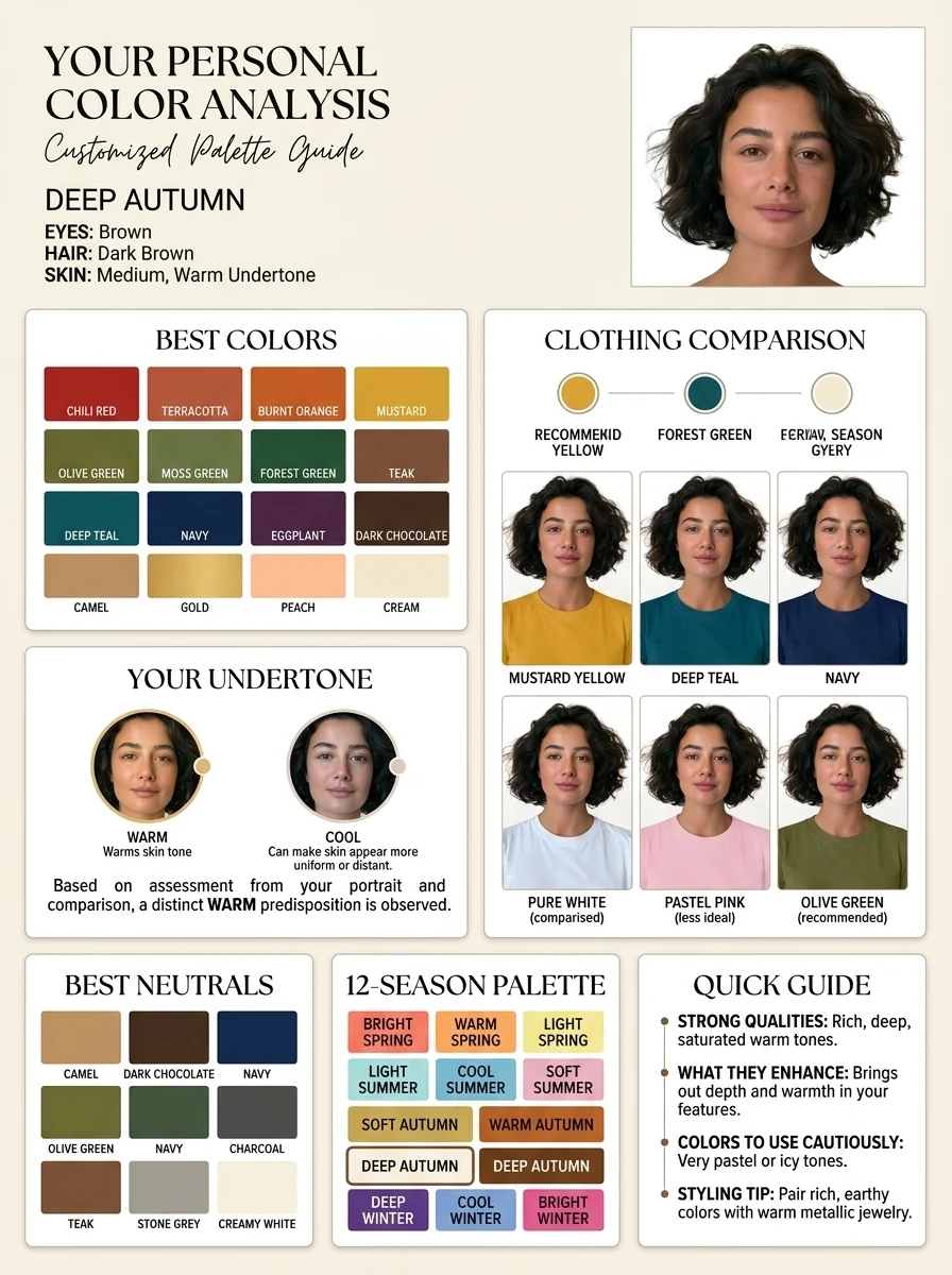
Use in Gemini 3.1 Flash Image (Nano Banana 2)
full prompt
Create a refined Personal Color Analysis infographic in a 3:4 portrait format. Use the attached infographic as a reference for its rich color content, elegant typography and beauty editorial mood. Improve the alignment and spacing of its sections. Use the uploaded portrait as the only reference for the person’s appearance. The colors and seasonal result must be chosen for this person, not copied from the example infographic.
Composition: Do not split the entire canvas into vertical columns. In the top section only, place the title, a short palette description and a few introductory details on the left. Place the main portrait in the upper-right corner, in a rectangular area approximately one third of the full image width. Below this top section, let the analysis cards span the full width of the page in a precise, balanced grid.
Main portrait: Replace the portrait’s original background with clean white and give it soft, even, professional studio lighting. Keep the person unmistakably the same. Preserve their exact facial features, face shape, expression, skin tone, eye color, hair color and distinctive details. Do not beautify, reshape or significantly retouch the face.
Include these sections, arranged neatly below the top section:
Best Colors: a generous selection of 12–16 distinct, labeled swatches, grouped in aligned rows. Include enough variety to make the palette genuinely useful.
Your Undertone: a concise photo-based assessment with a simple visual indicator. Avoid claiming certainty if the source lighting makes it unclear.
Clothing Comparison: six equally sized examples in a 3-column × 2-row grid. Show the same person in the same pose, crop and lighting, wearing six different solid-color tops. Change only the clothing color. Include a mix of recommended colors and useful comparison colors, with a short label beneath each. Keep the person’s face and natural skin tone identical in all six examples.
Best Neutrals: at least six labeled swatches in an orderly row or grid.
12-Season Palette: a compact, aligned grid of all twelve seasons, with the estimated match clearly highlighted. Keep this consistent with the recommended swatches.
Quick Guide: four brief points covering the palette’s strongest qualities, what the colors enhance, colors to use cautiously, and one practical styling tip.
Use the reference image’s warm cream background, sophisticated serif headings, restrained script accent and rich color presentation. Give every section consistent margins, card widths, padding and baseline alignment. Use subtle borders or shadows, ample breathing room and short, readable labels. Prioritize accurate, coherent color comparisons and faithful facial identity over decorative text. The final result should feel like a carefully art-directed magazine infographic.
Text to image